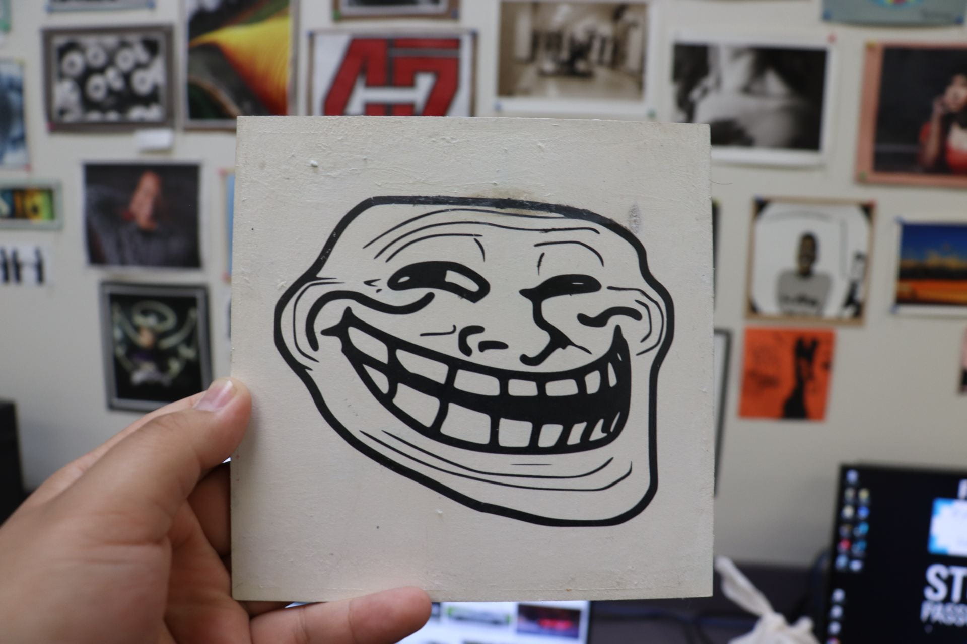
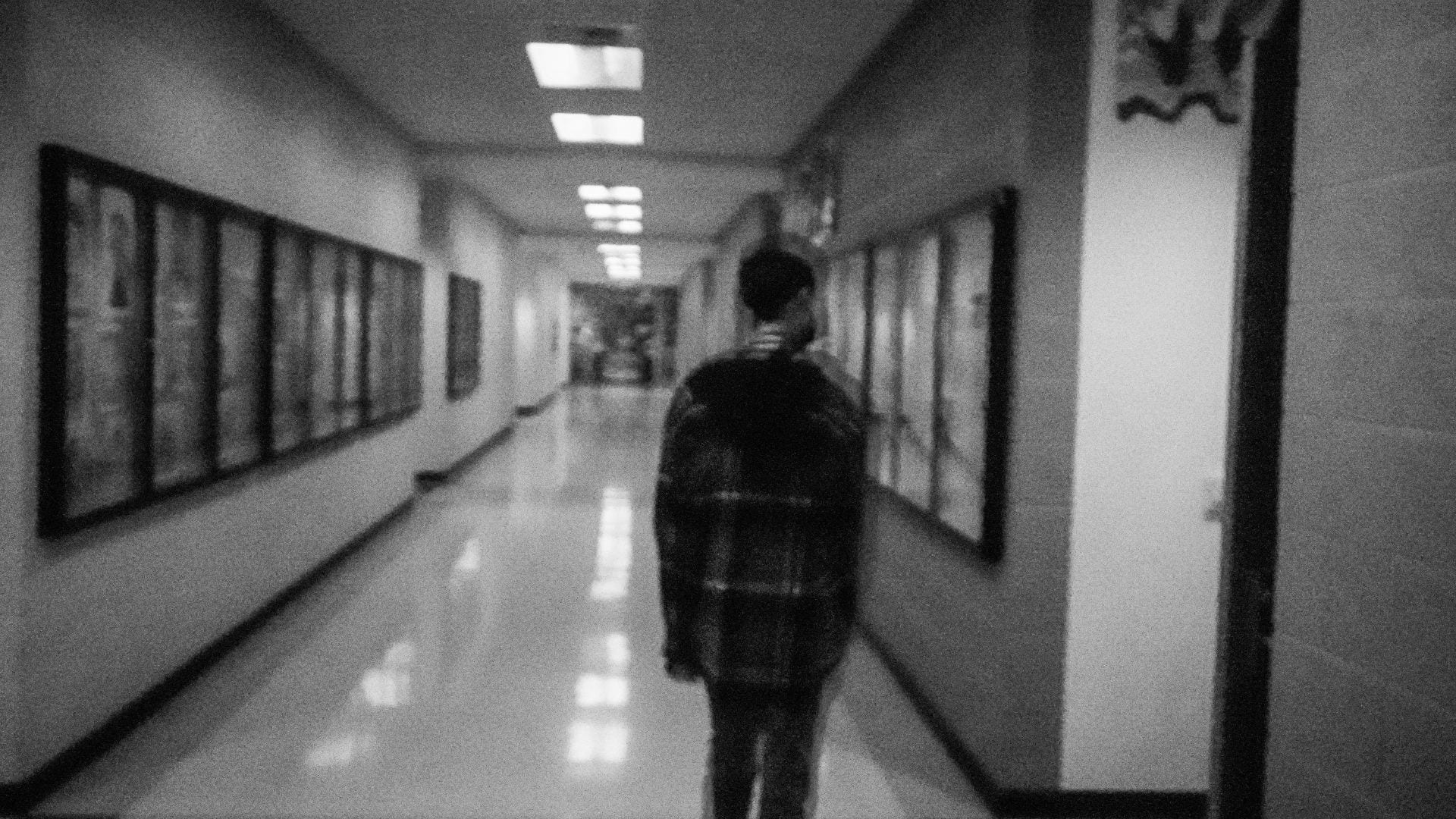
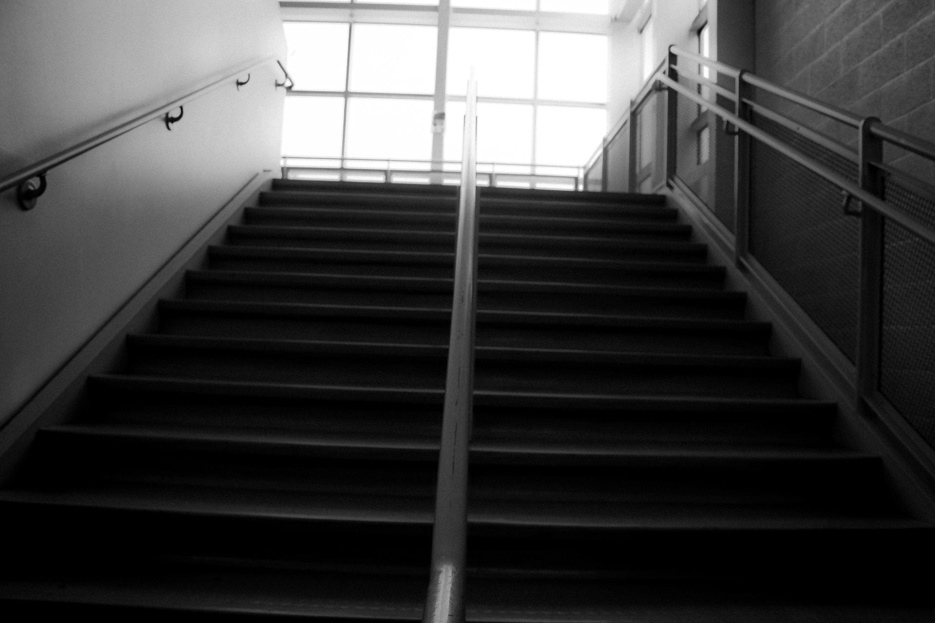
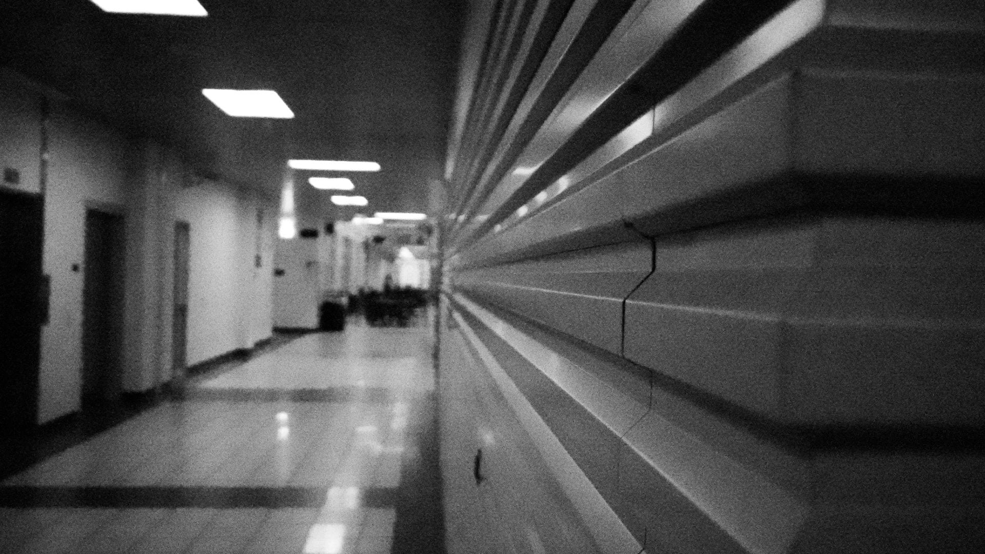
collage from a theme
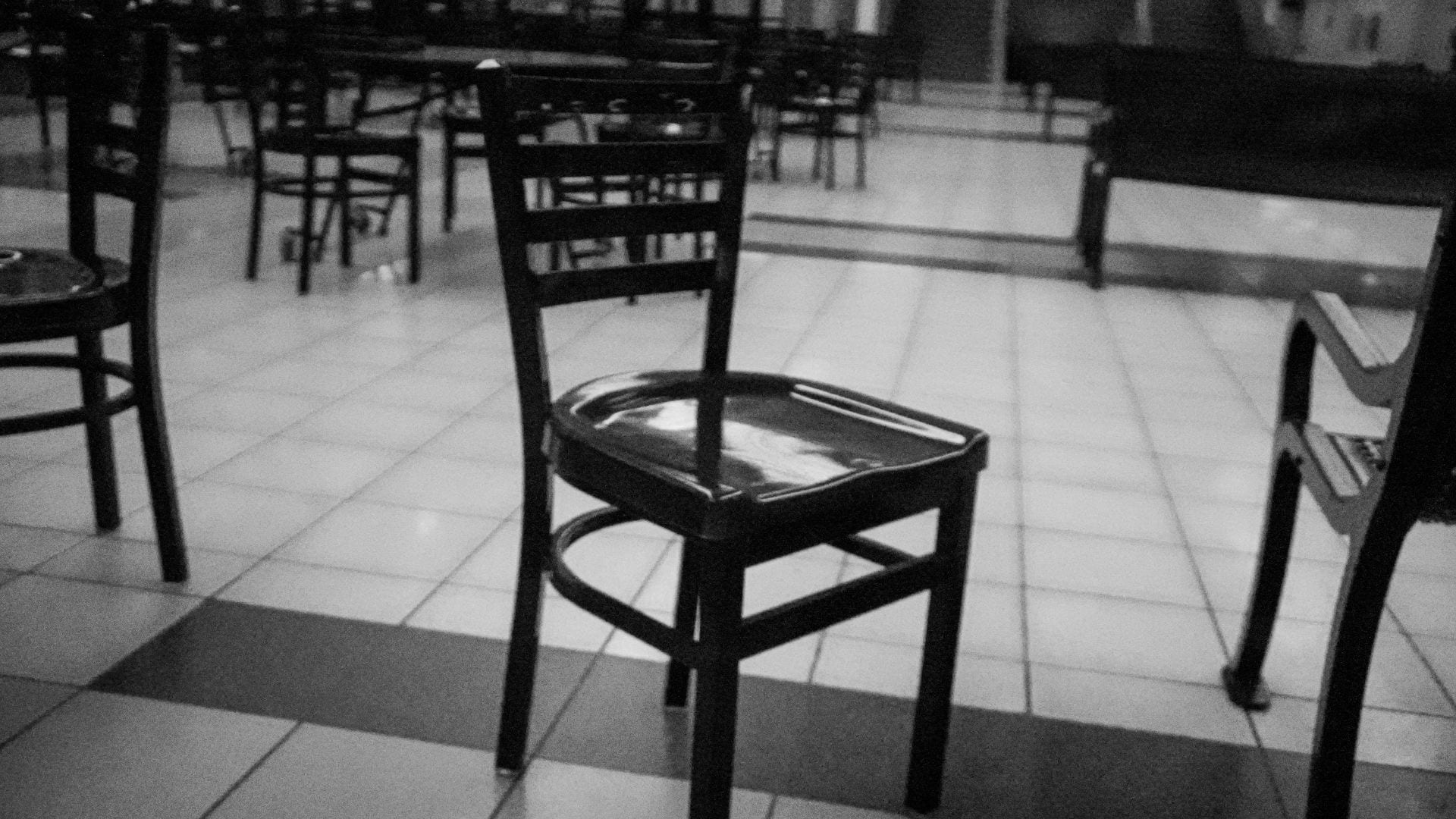
black and whites for the epic
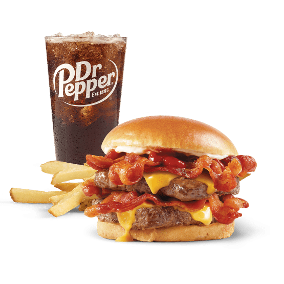
food photography
These two pictures are for the brands Wendys and IHOP. Which both use lighting and composition. First with the Burger from Wendys which is called the baconator and has good emphasis on the bacon and makes the burger seem big and makes the bacon red so it looks all around better. Along with everything being shiny including the bun and the burger has no defects which adds to its appearance.
The second image from IHOP is their pancakes and again shows good composition and lighting. This shows when staring at the pancakes where the hole of it is photograph in perfect lighting and makes the pancakes look fluffy. While the chocolate is shown all over the pancakes giving it good composition and makes the pancakes look great
Here are my two pictures
what’s inside my head?
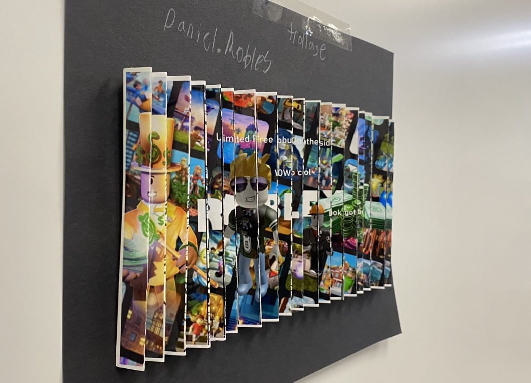
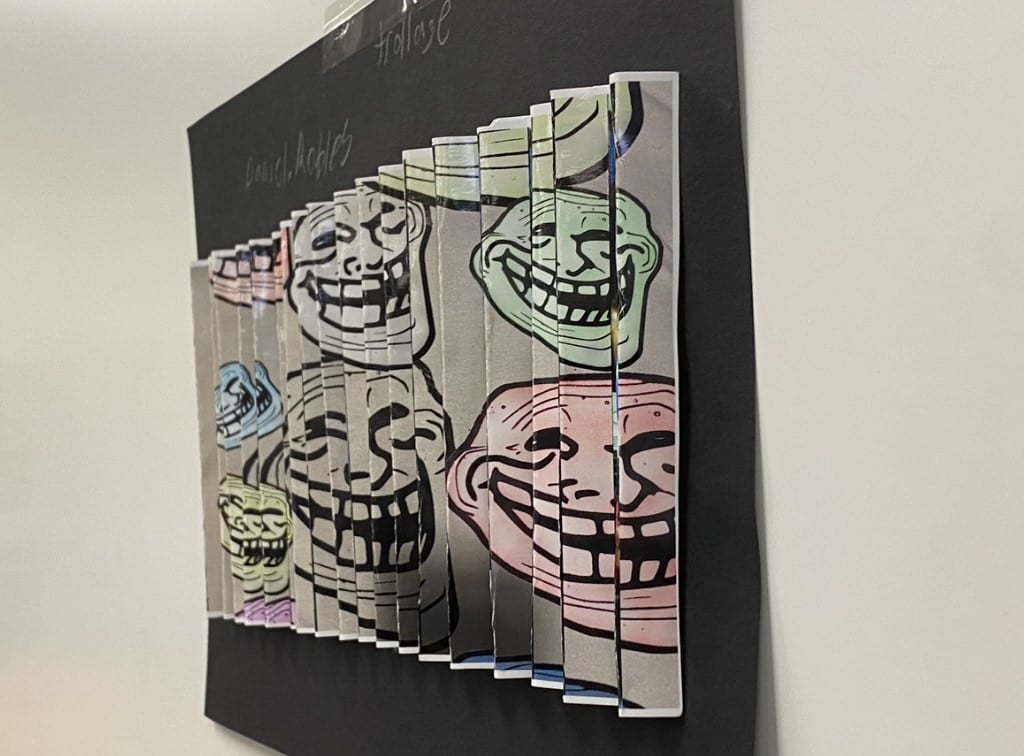
Kinoptic art
picture illustration
JHHS photography logo New epic
Shape color and other such
photo story
https://express.adobe.com/page/pf63UyyTfSe95/
